Brand guidelines & press kit
Use it
properly
Everything needed to represent SAJW Group in print, on screen and in press. If your use case is not covered here, write to press@sajw-group.com before improvising.
Version 1.0 — issued 2026. These assets are provided for editorial and partnership use only.
The lockup
SAJW Group
SAJW Group
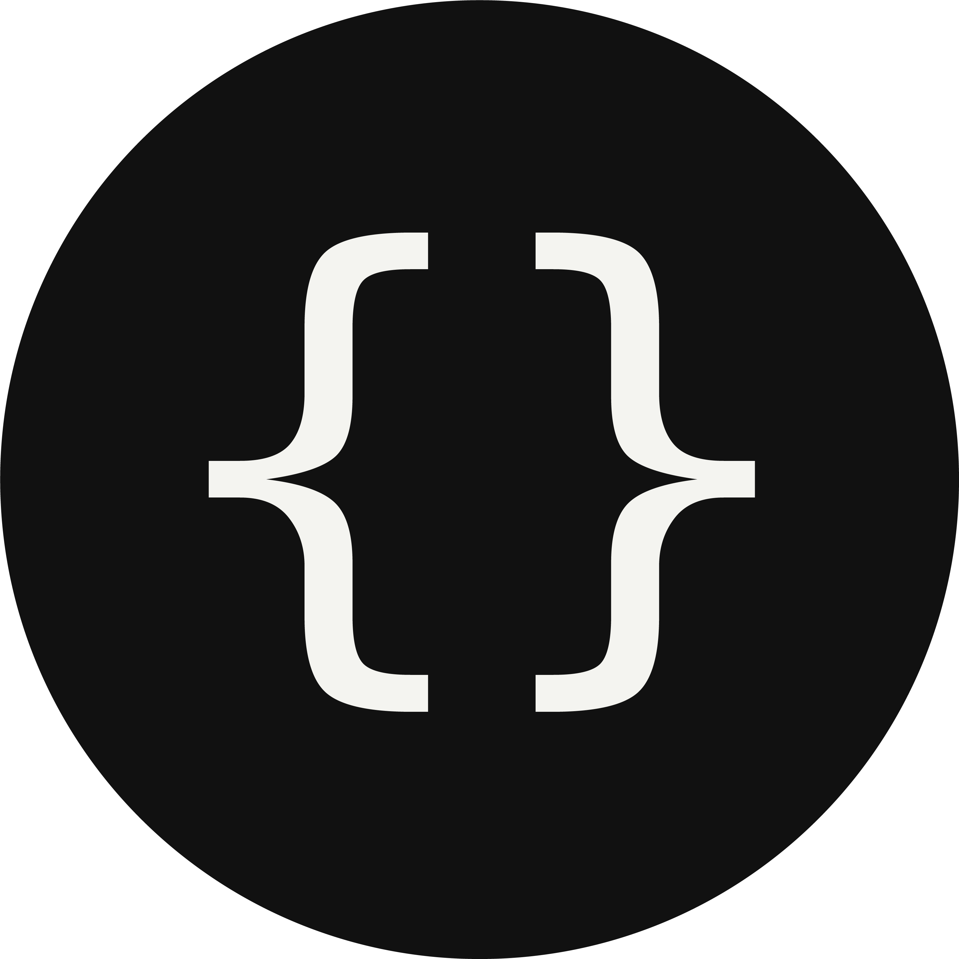
Primary lockup on paper; inverted lockup on ink. The mark may stand alone at small sizes.
Colour
Typography
Accent typeface — specimen
ABCDEFGHIJKLM
NOPQRSTUVWXYZ
abcdefghijklm
nopqrstuvwxyz
0123456789
The quick brown fox jumps
- Display
- SAJW Accent — uppercase, 0.01em tracking, 1.18 leading
- Character set
- A–Z, a–z, 0–9 and core punctuation. No accented characters, em dash or currency symbols — set those in the body face.
- Body
- Helvetica Neue / system sans — 1.6 leading minimum
- Labels
- Monospace — 11px, 0.18em tracking, uppercase
- Scale
- Fluid clamp() from 11px to 136px, no fixed breakpoints
Usage
Do ✓
- Use the brace mark at 24px or larger — the counters close below that.
- Keep clear space of one brace-width on every side.
- Use the inverted mark on ink-black surfaces.
- Set the wordmark in the accent typeface, uppercase, tracked at 0.01em.
- Keep display leading at 1.15 or looser — the capitals fill the full em box.
Don’t ✕
- Do not recolour the mark outside paper, ink or print red.
- Do not stretch, rotate, outline or add effects to the mark.
- Do not place the mark on photography without a solid holding shape.
- Do not set accented characters, currency symbols or em dashes in the accent face — it has no glyphs for them and they will fall back.
- Do not use the accent typeface for body copy under 18px.
Downloads
- Brace mark — PNG (1024px)PNG · transparent-safeDownload ↓
- Accent typeface — TTFTrueType · display useDownload ↓
Press enquiries and additional formats (SVG, EPS, lockup variants): press@sajw-group.com